What's new
AllBuffs | Unofficial fan site for the University of Colorado at Boulder Athletics programs

This is a sample guest message. Register a free account today to become a member! Once signed in, you'll be able to participate on this site by adding your own topics and posts, as well as connect with other members through your own private inbox!

  • Prime Time. Prime Time. Its a new era for Colorado football. Consider signing up for a club membership! For $20/year, you can get access to all the special features at Allbuffs, including club member only forums, dark mode, avatars and best of all no ads ! But seriously, please sign up so that we can pay the bills. No one earns money here, and we can use your $20 to keep this hellhole running. You can sign up for a club membership by navigating to your account in the upper right and clicking on "Account Upgrades". Make it happen!

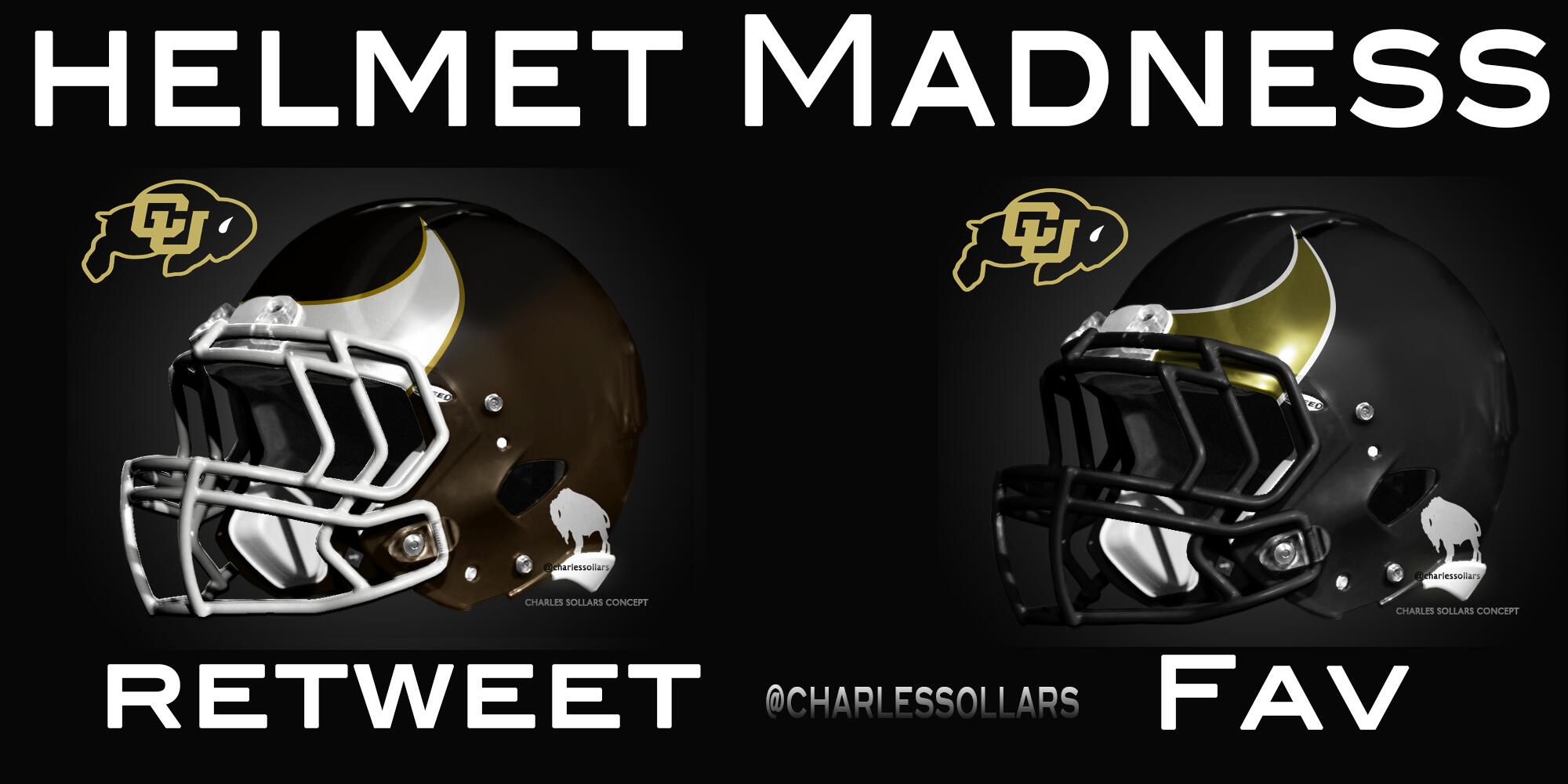
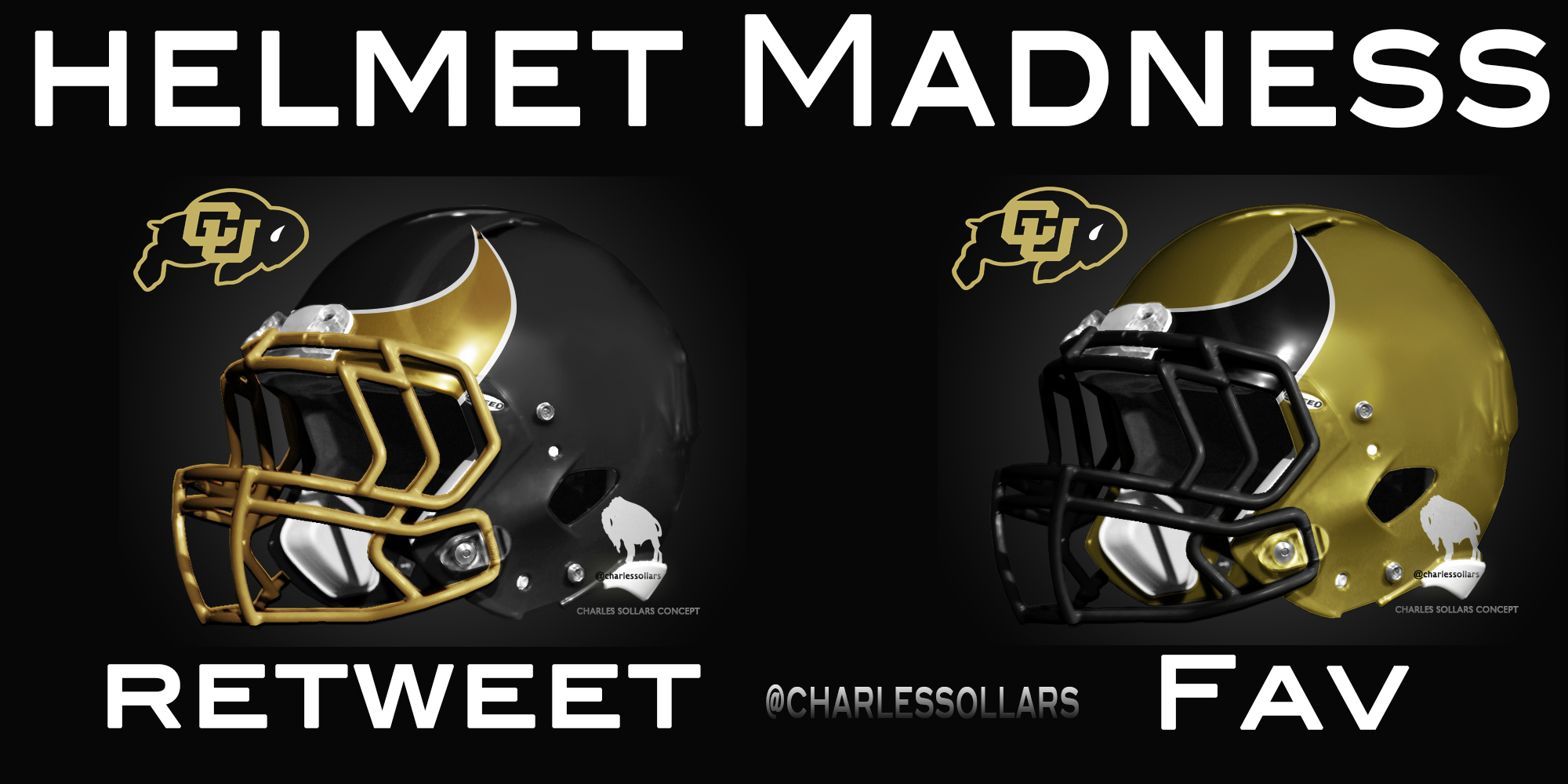
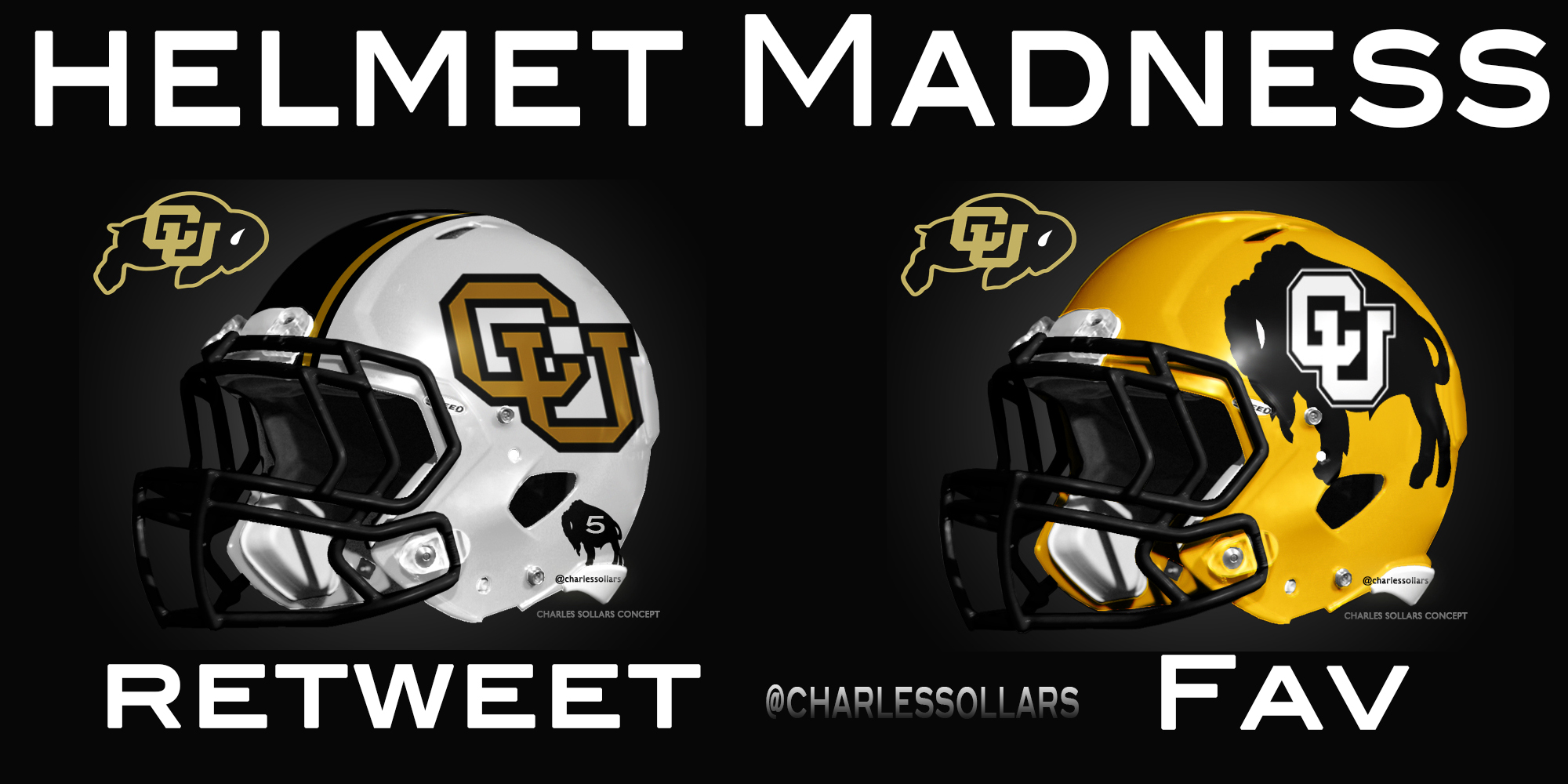
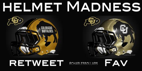
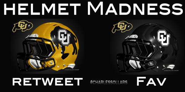
New helmet concepts for CU

I don't care for most of em.... most are too busy or too plain - no happy middle ground.

This is my favorite, the one on the right:

BM1oRZzCMAEdq_e.jpg:large
 
In all of them the buffalo is too intricate. The right horn one Dio posted above is okay if I have to pick one.
 
I kind of like these:

<blockquote class="twitter-tweet"><p><a href="https://twitter.com/search?q=%23Colorado&amp;src=hash">#Colorado</a> <a href="https://twitter.com/search?q=%23Buffs&amp;src=hash">#Buffs</a> Helmet Madness Set 21 <a href="https://twitter.com/GallowayJT">@GallowayJT</a> <a href="https://twitter.com/CUEquipment">@CUEquipment</a> <a href="https://twitter.com/Allbuffs">@Allbuffs</a> <a href="https://twitter.com/search?q=%23nike&amp;src=hash">#nike</a> <a href="https://twitter.com/buffzone">@buffzone</a> <a href="https://twitter.com/search?q=%23CU&amp;src=hash">#CU</a> <a href="https://twitter.com/search?q=%23Pac12&amp;src=hash">#Pac12</a> <a href="https://twitter.com/kevincorke">@kevincorke</a> <a href="http://t.co/h3l5ARqkMo">pic.twitter.com/h3l5ARqkMo</a></p>&mdash; Charles Sollars (@CharlesSollars) <a href="https://twitter.com/CharlesSollars/statuses/346046944445071360">June 15, 2013</a></blockquote>
<script async src="//platform.twitter.com/widgets.js" charset="utf-8"></script>
 
Can he run a bracket for which one is the worst, because those are all abominations.
 
I kind of like these:

<blockquote class="twitter-tweet"><p><a href="https://twitter.com/search?q=%23Colorado&amp;src=hash">#Colorado</a> <a href="https://twitter.com/search?q=%23Buffs&amp;src=hash">#Buffs</a> Helmet Madness Set 21 <a href="https://twitter.com/GallowayJT">@GallowayJT</a> <a href="https://twitter.com/CUEquipment">@CUEquipment</a> <a href="https://twitter.com/Allbuffs">@Allbuffs</a> <a href="https://twitter.com/search?q=%23nike&amp;src=hash">#nike</a> <a href="https://twitter.com/buffzone">@buffzone</a> <a href="https://twitter.com/search?q=%23CU&amp;src=hash">#CU</a> <a href="https://twitter.com/search?q=%23Pac12&amp;src=hash">#Pac12</a> <a href="https://twitter.com/kevincorke">@kevincorke</a> <a href="http://t.co/h3l5ARqkMo">pic.twitter.com/h3l5ARqkMo</a></p>&mdash; Charles Sollars (@CharlesSollars) <a href="https://twitter.com/CharlesSollars/statuses/346046944445071360">June 15, 2013</a></blockquote>
<script async src="//platform.twitter.com/widgets.js" charset="utf-8"></script>

I'd be interested to see what the one on the left looks like with whites.
 
Ugh!! The man has too much time on his hands, and no design sense. No thank you to all of them.
 
In all of them the buffalo is too intricate. The right horn one Dio posted above is okay if I have to pick one.

He may be doing that so CU doesnt come after him for unauthorized use of their logo. A couple of them arent bad. I wouldnt mind seeing a matte white helmet with an gold leaf looking logo as an alternate.
 
He may be doing that so CU doesnt come after him for unauthorized use of their logo. A couple of them arent bad. I wouldnt mind seeing a matte white helmet with an gold leaf looking logo as an alternate.
That's a good point. If that is the case, then they are not so bad.
 
i like the idea of the mountians on the helmets, but not the color scheme of mustard yellow and white. silver on black with a gold buff logo would look sharp.
 
The title of this thread should be RENAMED!

I thought for a moment that CU was thinking of adding some new helmet designs. Then I looked at the helmet designs and thought, "Oh **** no." Then I realized this was just some dude's personal designs. Thank God.

Those "concepts" are horrible. Do not want any of them.
 
Just looking at the design of his website gives me enough ammo to make an informed decision that the helmets probably all suck.

Upon further analysis, my theory is indeed correct.
 
I don't like the specific design this guy has for it, but having the flatirons with a buffalo standing on them is pretty cool.
 
Could anyone imagine the white buffalo outfit where there would be white helmets with black horns on them along with white jerseys and white pants?

EDIT: And anyone notice that with the horns on the helmets, there are small buffalo logos around the ear hole area? We could put the current CU logo there.
 
Have they picked your new helmets? I like your old ones. We (Cal) are getting matte finish
Our new helmets will be identical to our old ones. In other words, we're not getting new helmets. We might get a one-off single game helmet, but the design will stay pretty much the same.
 
Back
Top