AllBuffs | Unofficial fan site for the University of Colorado at Boulder Athletics programs
-
Prime Time. Prime Time. Its a new era for Colorado football. Consider signing up for a club membership! For $20/year, you can get access to all the special features at Allbuffs, including club member only forums, dark mode, avatars and best of all no ads ! But seriously, please sign up so that we can pay the bills. No one earns money here, and we can use your $20 to keep this hellhole running. You can sign up for a club membership by navigating to your account in the upper right and clicking on "Account Upgrades". Make it happen!
You are using an out of date browser. It may not display this or other websites correctly.
You should upgrade or use an alternative browser.
You should upgrade or use an alternative browser.
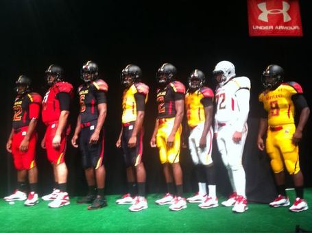
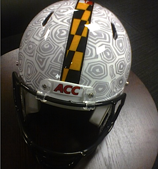
OMFG! Did you see what Under Armour did to Maryland?
- Thread starter Buffnik
- Start date
CVilleBuff
Well-Known Member
Saw it a few days ago, absolutely brutal. Kind of fitting though, Edsall is a douche
Suddenly it looks like Phil Knight has good taste. Is it too late to get in on some of Maryland's recruits?
The worst thing to happen to college football this past year isn't all the off-field scandals it's these hip-hop uniforms that some teams are coming out with.
whatthebuff
Club Member
I don't know much about fashion, but I know enough to not to wake up and dress like ****ing rainbow man.
BehindEnemyLines
beware the habu
Makes UO's uniforms look VERY good.
disagree, but neither team is winning this race
Yeah those are ****ing brutal, I bet Van Pelt is a mad mofo lol. It looks like a qb forgot to take his practice vest off before picture day. Hilarious.The yellow top white pants has to be the worst thing I've ever seen in my life.
LongHaulBuff
Club Member
How the hell is this "hip hop"? It just looks like **** to me.The worst thing to happen to college football this past year isn't all the off-field scandals it's these hip-hop uniforms that some teams are coming out with.
fatbuff
Member
How the hell is this "hip hop"? It just looks like **** to me.
I think you answered your own question.
LongHaulBuff
Club Member
No I didn't and neither did you.I think you answered your own question.
yellow on the helmet ruins an otherwise sweet motif. Nothing more pathetic then trying to out nike nike.
fatbuff
Member
No I didn't and neither did you.
You did'nt know hiphop = ****?
fatbuff
Member
Florida's new uniform:

Thats some funny hiphop, right there.
Check out the Tim Tebow jorts slideshow: http://bleacherreport.com/articles/120439-a-jort-is-a-jort-of-course-of-course
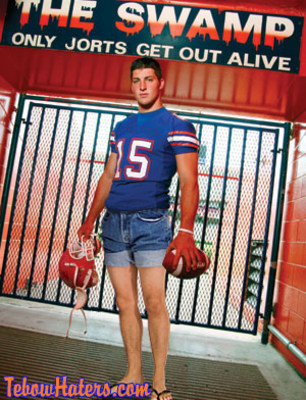
:rofl:

:rofl:
I think you answered your own question.
You did'nt know hiphop = ****?
:nod:
That's the exact reference I was trying to convey.
Share:
