AllBuffs | Unofficial fan site for the University of Colorado at Boulder Athletics programs
-
Prime Time. Prime Time. Its a new era for Colorado football. Consider signing up for a club membership! For $20/year, you can get access to all the special features at Allbuffs, including club member only forums, dark mode, avatars and best of all no ads ! But seriously, please sign up so that we can pay the bills. No one earns money here, and we can use your $20 to keep this hellhole running. You can sign up for a club membership by navigating to your account in the upper right and clicking on "Account Upgrades". Make it happen!
You are using an out of date browser. It may not display this or other websites correctly.
You should upgrade or use an alternative browser.
You should upgrade or use an alternative browser.
Worst uniforms in college football
- Thread starter 77buff
- Start date
See, now the Oregon Uniform that's shown above would be OK if they did just a couple things. First, get rid of the neon green socks. That's about as ghey as is humanly possible. Second, get rid of the wings on the shoulder pads. Just. Stupid. The helmet/jersey/pant combo actually works. I'm not a big fan of the slanted numbering, either, but I could live with it if they made the other changes.
Of course, they were at a disadvantage against Auburn, who has some of the tightest threads in all of college football, IMO. Simple, straightforward, classic.
Of course, they were at a disadvantage against Auburn, who has some of the tightest threads in all of college football, IMO. Simple, straightforward, classic.
JJBuff
Club Member
Did Oregon change their official school colors to Graphite and Neon Yellow? Does the uniform posted even have one UO school color?
Even if your colors suck (Oregon, Wyo, VT) you shouldn't forsake them altogether. I guess times have changed. So much for the Tradition of College Football. Thank you, Nike.
Even if your colors suck (Oregon, Wyo, VT) you shouldn't forsake them altogether. I guess times have changed. So much for the Tradition of College Football. Thank you, Nike.
Unleash Hell
Well-Known Member
I like the Oregon all blacks, but you know what? With all the ugliness of Oregon's unis and how many different ones they use, recruits love them. HUGE, HUGE, HUGE selling point for Oregon's recruits.
Sexton Hardcastle
Club Member
Wyoming.
Sexton Hardcastle
Club Member
What makes up for the smell?Wyoming is at a decided disadvantage. Brown and yellow, while representative of the landscape around Laramie, WY, makes for pretty awful uniforms.
Deleted member 807
Guest
Nike did a fine job screwing up both Virginia Tech and Boise State when they put them in the 3D friendly uniforms.
 The Army's all camo specialty uniform is hard on the eyes. But it's atleast got some integrity behind the choice.
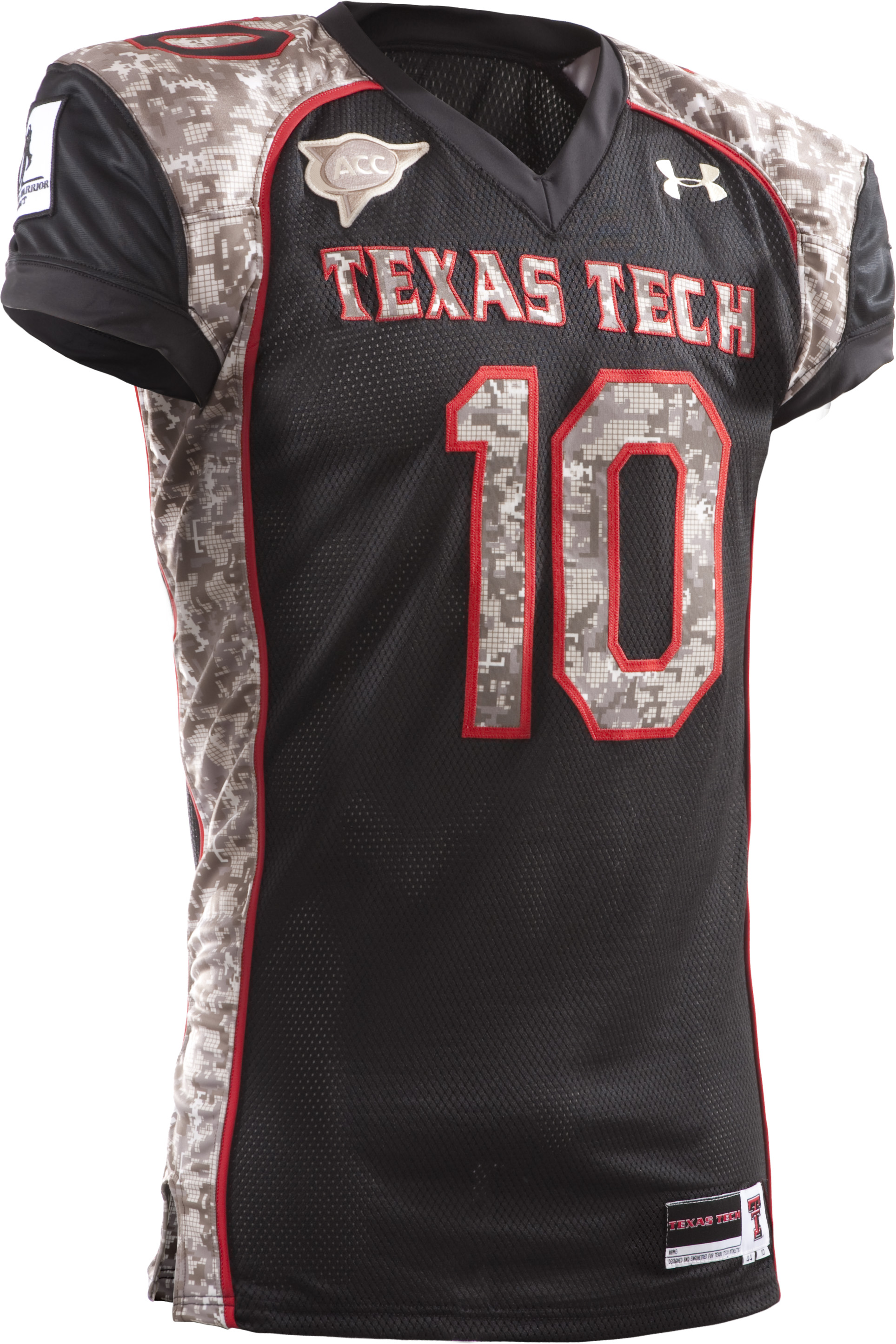
 When Texas Tech does camo, it's horrible, even if it was a gimmick for a good cause.


I like the Oregon all blacks, but you know what? With all the ugliness of Oregon's unis and how many different ones they use, recruits love them. HUGE, HUGE, HUGE selling point for Oregon's recruits.
I think it's less the uniforms and more the bottomless pit of money that paid for them that is the attractive thing.
texas tech, ACC, :wtf:
Deleted member 807
Guest
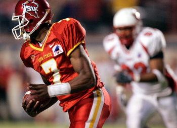
The old Iowa State McDonald's themed red uniforms were hidious.
 It's even worse when Eastern Washington does that look on their bloody turf.


The old Iowa State McDonald's themed red uniforms were hidious.It's even worse when Eastern Washington does that look on their bloody turf.

I agree on Iowa State. I think they are the all-time worst uniforms in college football.
why does tech have the ACC patchNike did a fine job screwing up both Virginia Tech and Boise State when they put them in the 3D friendly uniforms.The Army's all camo specialty uniform is hard on the eyes. But it's atleast got some integrity behind the choice. When Texas Tech does camo, it's horrible, even if it was a gimmick for a good cause.

Deleted member 807
Guest
I've never been a big fan of the mashed-carrot baby diarrhea orange worn by the Longhorns. Mercifully UT has not worn an all orange pant/jersey combo.
The all orange look sported by Clemson and Okie Lite deserves mention as nominees for ugliest uniforms.


And since Orange pants are the theme of this post, here is CSU's hideous old alfalfa and pumpkin look.

The all orange look sported by Clemson and Okie Lite deserves mention as nominees for ugliest uniforms.


And since Orange pants are the theme of this post, here is CSU's hideous old alfalfa and pumpkin look.

class01
Well-Known Member
Wyoming is at a decided disadvantage. Brown and yellow, while representative of the landscape around Laramie, WY, makes for pretty awful uniforms.
Wyoming's uniforms the last 5-10 years have indeed been awful. Not necessarily because of their colors, but more because how they are used. We had the same colors when I played HS football (I played for the same team as Bobby Purify). Dark brown jerseys with white pants and white helmets is not bad at all. Throw in a few yellow highlights (my HS switched to gold) and its not the end of the world. WYO's problem recently is that they use way too much yellow (esp the pants) and tried to modernize/bronconize their uni's.
The old Iowa State McDonald's themed red uniforms were hidious.]
They couldn't even match the dark red helmets to the bright red uniforms. Idots.
aik
Well-Known Member
I've never been a big fan of the mashed-carrot baby diarrhea orange worn by the Longhorns. Mercifully UT has not worn an all orange pant/jersey combo.
Pantone 159 is not a good look on anything. What I find more offensive is their white on white on white, "white and tight so you can tell what religion they are" road uniforms. Hopefully all of their games in which they are not playing a Pac-12 opponent will be on their own network.
Mick Ronson
Well-Known Member
Okie State has had some serious traffic cone action going at times.
That red field makes me want to gouge my eyes out...I agree on Iowa State. I think they are the all-time worst uniforms in college football.
77buff
Well-Known Member
I might have to change my vote to TT camo, and Nike gets out uglied by Under Armour. It takes alot to out ugly Nike.Nike did a fine job screwing up both Virginia Tech and Boise State when they put them in the 3D friendly uniforms.The Army's all camo specialty uniform is hard on the eyes. But it's atleast got some integrity behind the choice. When Texas Tech does camo, it's horrible, even if it was a gimmick for a good cause.

Highflyer
Club Member
Wyoming's uniforms the last 5-10 years have indeed been awful. Not necessarily because of their colors, but more because how they are used. We had the same colors when I played HS football (I played for the same team as Bobby Purify). Dark brown jerseys with white pants and white helmets is not bad at all. Throw in a few yellow highlights (my HS switched to gold) and its not the end of the world. WYO's problem recently is that they use way too much yellow (esp the pants) and tried to modernize/bronconize their uni's.
I remember Palmer having the ugliest unis in the metro league for as long as we played them. Brown is just a bad sports color all around.
Timbuff10
Member
It may not be popular but I say the ones we wore during that night game back in 98 i think it was. That Las Vegas gold is crap. Looked like someone pissed all over us. The helmet wasnt bad that night but nothing beats the original. I really wish they would do away with that las vegas gold and stick with whatever you call that yellowish gold that most CU shirts are done it.
If they just stuck with that color, it would stand out far more at the games and look so much better than all the different colors you see in the stands now.
If they just stuck with that color, it would stand out far more at the games and look so much better than all the different colors you see in the stands now.
The Guest
Guest
Am I the only one that remembers that craptacular uniform that aTM sported one year in the 90s? I can't find a photo, but it incorporated a plaid--yes, you read correctly, I said "plaid"--collar.
Rep to anybody who can produce a photo of that cluster****.
Rep to anybody who can produce a photo of that cluster****.
Share:
