SINKRATZ
PhD in Analogy
OK, here we go:
Cincinnati: 6/10. Points deducted for the armpit detail. Why?
Marshall: 5/10. Would have been 8/10 if they just stuck with the green and white sets. Points deducted for white helmets.
Michigan State: 3/10. Green and white is such a great combo, but Sparty managed to f**k it all up. It’s like Oregon’s uniforms but somehow managed to make them worse. I hope they lose a lot in these.
Oregon State: 6/10. The video seems over the top for a pretty modest uniform update. Nothing flashy, but pretty forgettable (so perhaps totally appropriate for that program). Armpit accent rings seem unnecessary.
Pitt: 8/10. Great color combo, and I like the number style - seems throwbacky without going too crazy. New logo is totally unoriginal but still a massive improvement over the previous pig-dog thing.


Vandy: 7/10. Alternate grey actually looks pretty sweet - I’m a sucker for using only 2 colors on the uniform set instead of 3. Need to see up close because this has all the makings of a mess if those anchor and chain details get too carried away. Keep it simple damnit!

Syracuse: 8/10. Smart move keeping the design simple when you have a color combo like this and ditching the blue helmet was a great move. Simple arm stripes are a winner. Score would have been higher without the white helmet.

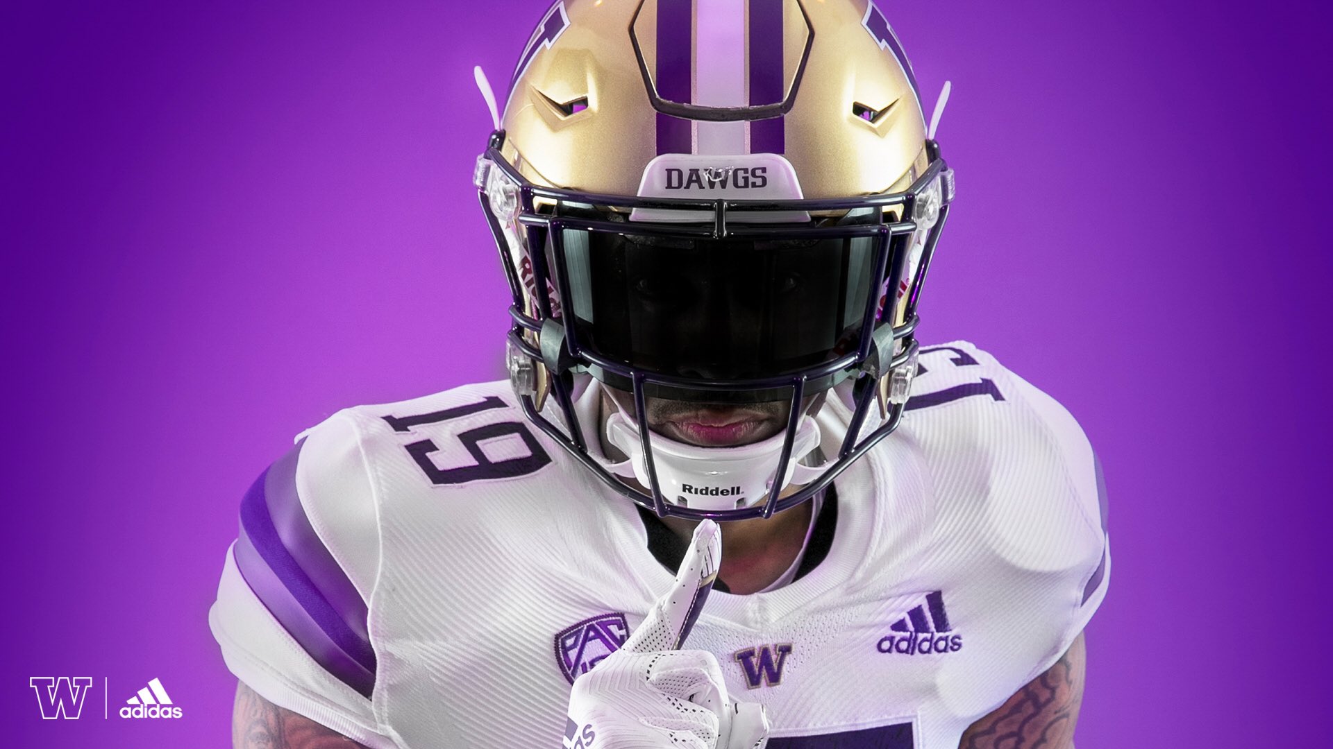
Washington: 8/10. Adidas did a nice job here simply by not f**king it all up. I like the subtle stripe on the arms with different shades of purple. I would love them to go with gold helmets all season but I suspect they’ll bust out a purple or white at some point and I’ll regret the nice things I said about adidas.


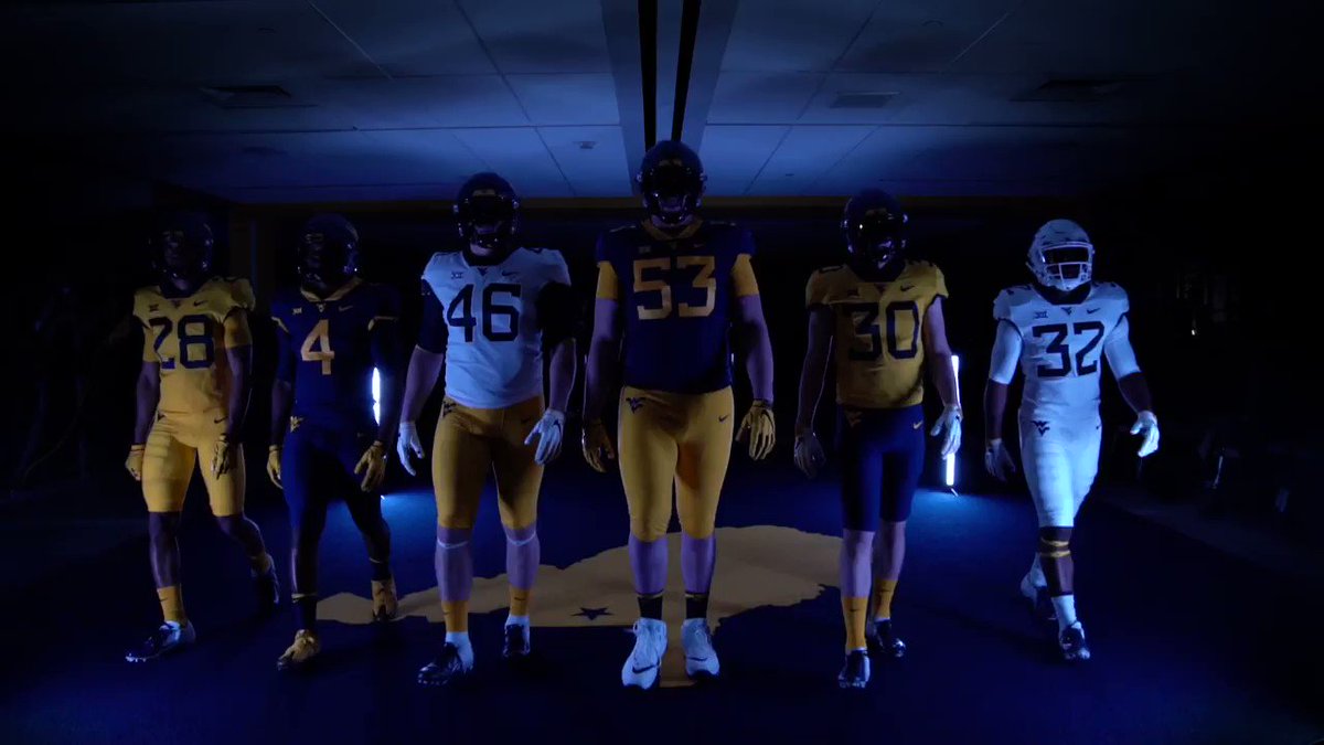
West Virginia: 5/10. Good move eliminating the all yellow set, but this grey is just meh. WVU would be better served with some deep charcoal grey instead of this light grey crap.
 twitter.com
 twitter.com
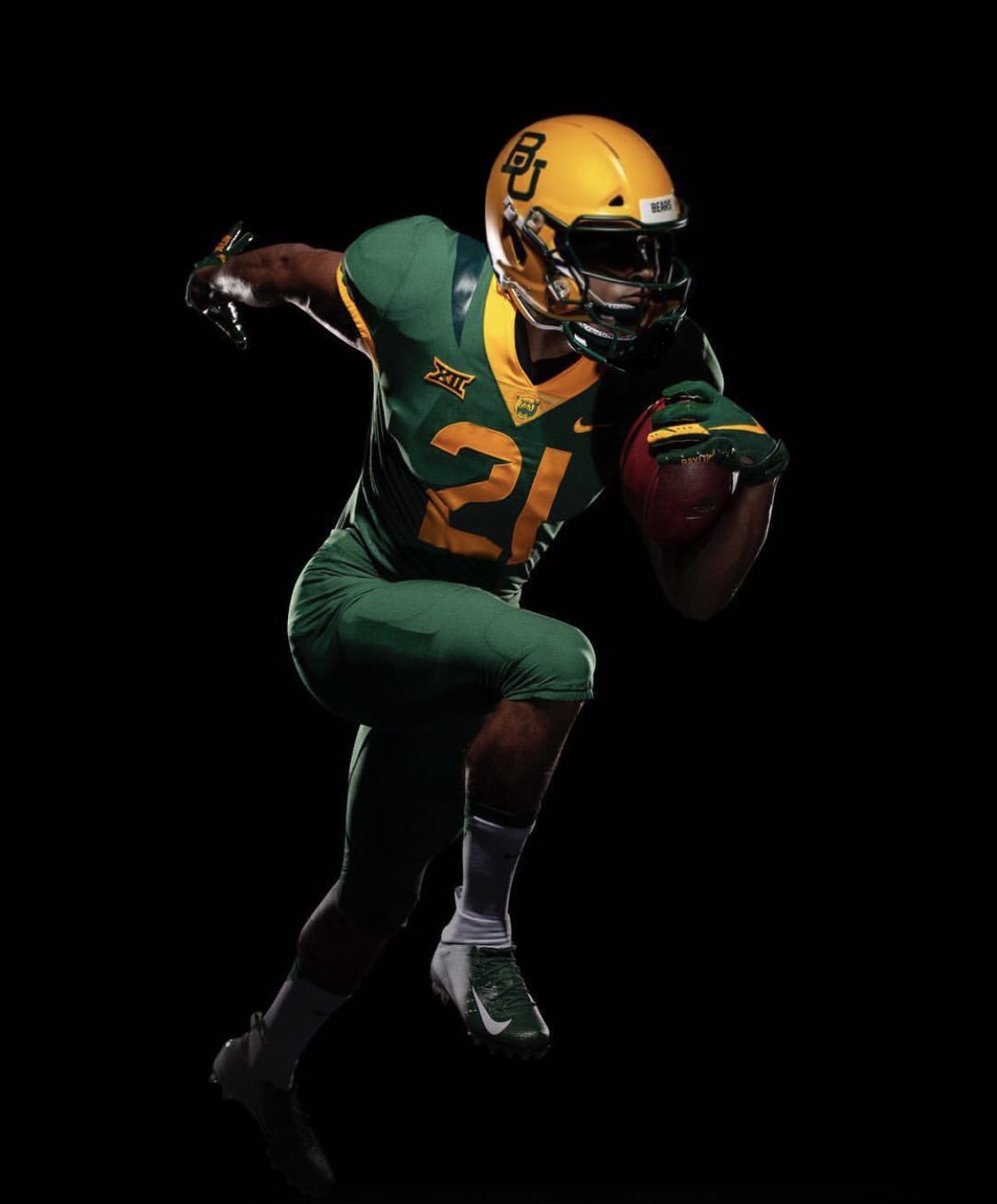
Baylor: 0/10. F**k Baylor.

Cincinnati: 6/10. Points deducted for the armpit detail. Why?
Marshall: 5/10. Would have been 8/10 if they just stuck with the green and white sets. Points deducted for white helmets.
Michigan State: 3/10. Green and white is such a great combo, but Sparty managed to f**k it all up. It’s like Oregon’s uniforms but somehow managed to make them worse. I hope they lose a lot in these.
Oregon State: 6/10. The video seems over the top for a pretty modest uniform update. Nothing flashy, but pretty forgettable (so perhaps totally appropriate for that program). Armpit accent rings seem unnecessary.
Pitt: 8/10. Great color combo, and I like the number style - seems throwbacky without going too crazy. New logo is totally unoriginal but still a massive improvement over the previous pig-dog thing.


Vandy: 7/10. Alternate grey actually looks pretty sweet - I’m a sucker for using only 2 colors on the uniform set instead of 3. Need to see up close because this has all the makings of a mess if those anchor and chain details get too carried away. Keep it simple damnit!

Syracuse: 8/10. Smart move keeping the design simple when you have a color combo like this and ditching the blue helmet was a great move. Simple arm stripes are a winner. Score would have been higher without the white helmet.

Washington: 8/10. Adidas did a nice job here simply by not f**king it all up. I like the subtle stripe on the arms with different shades of purple. I would love them to go with gold helmets all season but I suspect they’ll bust out a purple or white at some point and I’ll regret the nice things I said about adidas.


West Virginia: 5/10. Good move eliminating the all yellow set, but this grey is just meh. WVU would be better served with some deep charcoal grey instead of this light grey crap.

West Virginia Football on Twitter
“Don't forget about the grays! 🔥 #HailWV https://t.co/5scbTRMTpj”

West Virginia Football on Twitter
“Montani Semper Liberi. #HailWV ➡️ https://t.co/egvqkP0Zpt https://t.co/omlF1331MO”
Baylor: 0/10. F**k Baylor.


Last edited:
