What's new
AllBuffs | Unofficial fan site for the University of Colorado at Boulder Athletics programs

This is a sample guest message. Register a free account today to become a member! Once signed in, you'll be able to participate on this site by adding your own topics and posts, as well as connect with other members through your own private inbox!

  • Prime Time. Prime Time. Its a new era for Colorado football. Consider signing up for a club membership! For $20/year, you can get access to all the special features at Allbuffs, including club member only forums, dark mode, avatars and best of all no ads ! But seriously, please sign up so that we can pay the bills. No one earns money here, and we can use your $20 to keep this hellhole running. You can sign up for a club membership by navigating to your account in the upper right and clicking on "Account Upgrades". Make it happen!

Official Construction Update Thread

I'm well aware how the Dal Ward looks, the concrete sections on the East side about match the height of the new facility

Anyone who can't appreciate Shakespeare has forfeited their credibility in discussions of aesthetic nuance.
 
People are correct, it's actually consistent with the rest of Folsom. But maybe it needs to be painted?

from phone

No, looking at that wall from the field, in the rendering you posted, what you see is that it doesn't match the brick of the new facilities and Dal Ward. It's all about perspective, I guess.
 
And yet straight to the point that started this

Point is that the concrete wall adheres to the architectural language of the east side ... of Nebraska.
4935394440_56092355a4.jpg


It's a big ugly wall that would look better with flagstone up top at same level as Dal Ward.
 
Last edited by a moderator:
...It's a big ugly wall that would look better with flagstone up top at same level as Dal Ward.

Totally agree. Someone mentioned that the shadows deemphasize the concrete wall in the renderings. It's a tool that has been used before. It should be claded in stone to match the rest of the exterior language.
 
Bit of a stretch to make such a declaration. There is no wall of concrete with the same height or square footage of concrete anywhere else in the stadium. A concrete base on the ground level has flagstone above it, except on that wall. To argue the cement wall is consistent with the rest of Folsom is just not accurate.

If Tuscan vernacular Revival is the language of CU campus, that wall and pie-shaped nook is Ebonics.

Anyone who can't appreciate Shakespeare has forfeited their credibility in discussions of aesthetic nuance.

Function over form. It is what it is.

Point is that the concrete wall adheres to the architectural language of the east side ... of Nebraska.
4935394440_56092355a4.jpg


It's a big ugly wall that would look better with flagstone up top at same level as Dal Ward.

This sort of effort in the Uniform Thread could be a game changer...
 
I understand how this happened. In a world of finite resources, they opted for more features inside the facility rather than spending more on the exterior in the belief the exterior as currently being constructed would be good enough.

We won't know if they made the right choice for a few years when the new construction gets a chance to age a bit and see how well it fits in.

Put it this way: if you had a choice between a rocked out exterior or an extra recovery pool inside, which would you have picked?

False. An in-house barber shop is the correct answer.
 
In a world of finite resources, they opted for more features inside the facility rather than spending more on the exterior in the belief the exterior as currently being constructed would be good enough.

Agree this is likely what happened.

Cutting corners, both literally and figuratively, is where CU excels.

If the football program is the front porch of the university, that space between the Dal Ward and Center for Excellence is the front door. This is the backdrop for where Ralphie starts her iconic run and where the players are shown charging out to greet the fans. Millions of eyeballs see that concrete wall every time CU plays football. That facade gets more TV visibility than most any other place on campus. Skimping on aesthetics on that piece of campus is not a good idea.
 
i don't think anyone is freaking out. i, like many others, think it looks a little odd and wish there was some flagstone on it. tini once again takes it as a crusade against the university.
 
i don't think anyone is freaking out. i, like many others, think it looks a little odd and wish there was some flagstone on it. tini once again takes it as a crusade against the university.

I like the flagstone looks as well, but I just think it might look totally different in context of the finish product
 
I like the flagstone looks as well, but I just think it might look totally different in context of the finish product

I am led to believe from the populous/Mortenson material posted on the Sustainable Excellence Initiative website that the NE bleacher section IS the completed project, at least on the exterior.
 
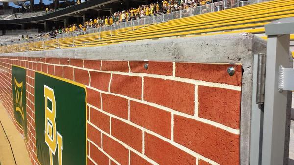
**** Baylor's new stadium received some critical commentary about the harsh look of naked concrete. They fixed the problem using a tarp with a nice brick pattern.

baylor-brick-wall-tarp.jpg


Nobody laughed at them.
 
Agree this is likely what happened.

Cutting corners, both literally and figuratively, is where CU excels.

If the football program is the front porch of the university, that space between the Dal Ward and Center for Excellence is the front door. This is the backdrop for where Ralphie starts her iconic run and where the players are shown charging out to greet the fans. Millions of eyeballs see that concrete wall every time CU plays football. That facade gets more TV visibility than most any other place on campus. Skimping on aesthetics on that piece of campus is not a good idea.
I'm amazed at people's ability to get worked up over what basically amounts to a tunnel wall. I personally think it looks a little bland, but know the color will change over time and I'm willing to let it settle to see the final outcome. Nothing says you cannot go back and do something about it later, and again - finite resources. Not everyone has Phil Knight in their back pocket. I would rather have that barbershop!
 
I'm amazed at people's ability to get worked up over what basically amounts to a tunnel wall. I personally think it looks a little bland, but know the color will change over time and I'm willing to let it settle to see the final outcome. Nothing says you cannot go back and do something about it later, and again - finite resources. Not everyone has Phil Knight in their back pocket. I would rather have that barbershop!

Worked up /= having a dialog that critiques the product all of us should be and many of us are financially supporting.

If opinions about the look of Folsom is not a suitable subject in a thread about the construction of this project, then perhaps I misunderstand the purpose of the message board.
 
Nah. Maybe a small scoreboard or an sign listing the altitude would be nice imo

Small scoreboard where the Pepsi logo is would be cool assuming it cant be touched by people in the seats in 121. Or potentially a big CU sign that frames Ralphie's Run
 
If you're talking about the interior portion of the east side addition surrounding the suites, that's the ugliest portion of Folsom IMO.
I'm talking about the whole East side. I've spent a lot of time in those areas, it doesn't look out of place with the rest of the area
 
I'm talking about the whole East side. I've spent a lot of time in those areas, it doesn't look out of place with the rest of the area

Yeah, but you also think our uniforms look cheap, out of date, and unattractive.

You have one opinion. Others are entitled to theirs.
 
Back
Top